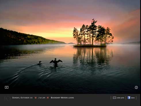
Apple just approved our latest iPad app, Jim Brandenburg's Chased By The Light. Lynn Phelps (Phelps Design) did the design, I did the technical production. This app is derived from the popular coffee table book of the same name. The RGB photos look stunning on the iPad...surpassing the best CMYK printing. We used InDesign and the new Adobe Digital Publishing Suite Single Edition to create the app.
The app contains video commentary, where Jim discusses how and why he took some of the shots. Throughout the book, we wanted the photography to be big, beautiful, and to take center stage. We didn't want video elements and icons to clutter up the screens. We also wanted the user to be able to view the photo while the video was playing.
If a particular photo has an accompanying video, there is a small "v" icon in the bottom left corner. When a user taps the "v" icon, the video plays in a 320px by 240px area in the bottom left corner. How did we do this?
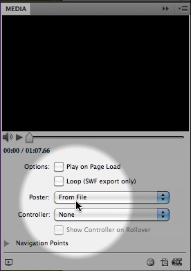
The trick is to create a transparent "poster frame". We created a 320px by 240px PSD file in Photoshop that contains the white "v" icon artwork on a transparent background. We then used this mostly-transparent file as the "poster frame" for the video. You can choose a poster frame file for DPS video using the Media panel.


1 comment:
Very clever, Keith. Thanks for sharing this great tip.
Post a Comment