Showing posts with label Design. Show all posts

Wednesday, July 17, 2013

Adobe looking for student reps

Adobe is "recruiting Adobe enthusiasts to help spread the Adobe Creative Cloud love on campus!"

According to Adobe, "as an Adobe Student Rep, you will teach your friends, classmates, and community tools and techniques to help them stand out with Adobe Creative Cloud. If you’re passionate about design or video and want hands-on marketing and event planning experience with a company that is changing the world through digital experiences, this program is for you."

Read more, and fill out an application here.

Monday, May 06, 2013

News from Adobe MAX day 1

I'm at the Adobe MAX conference this week. At the keynote session this morning, Adobe made a LOT of announcements. If you are interested in Adobe's vision of the future of graphic design (and you should be) watch the recording of the keynote here.

I'll no doubt be writing much more about this here in weeks to come. But here are a few hightlights of particular note to readers of this blog:

CS6 is the final version of Creative Suite

Future versions of InDesign, Illustrator, Photoshop and other programs will be named InDesign CC, Illustrator CC, Photoshop CC, etc. The only way to stay up to date with these programs will be via a Creative Cloud membership. Many of the Creative Cloud revisions will be rolled out in June.

Previous versions

When CC versions of programs are released, CS6 versions will also remain available for download as part of your Creative Cloud subscription.

Fireworks is dead

Adobe has ceased further development of Fireworks. They will continue to sell Fireworks CS6, and it will remain downloadable for Creative Cloud members.

InCopy is part of Creative Cloud

At long last, InCopy, the editorial version of InDesign, will be part of your Creative Cloud subscription.

Typekit fonts for the desktop

Typekit, Adobe's platform for serving fonts to Web sites, is being extended to make many of the Typekit fonts available for desktop use in InDesign, Illustrator and Photoshop. With a technology called "Sync fonts" you can locate a Typekit font, sync it to your system, and it will be available immediately for use.

Upgrade for CS6 users

There will likely be a variety of upgrade paths and offers to Creative Cloud, but a $19.95/month "first year" price for owners of CS6 was announced.

Tuesday, January 29, 2013

Great DPS tutorial about using libraries to store repetitive interactive elements

Rick Borstein has written a very comprehensive tutorial in the Adobe Developer Connection about how to store all the interactive "bits and pieces" of a slideshow in an InDesign Library, so that additional slideshows can be created with a minimum of fuss in the future.

Very nice!

ScreenSnapz001

Wednesday, January 02, 2013

Resources for creating mockups

Here are four tools that I've found useful for creating design mockups and comps:

1. LiveSurface files make it easy to create photo-realistic mockups in Photoshop. See my previous blog post about this valuable resource here.

2. A similar resource is this collection of mockup templates from Arsenal. 

3. MockupEverything lets you create easy mockups completely online, no knowledge of Photoshop needed. Just select a template and upload your art to create a mockup.

4. lorempixel is a placeholder image generator. Just enter the width and height of your desired image in pixels, choose a subject category, and indicate if you want color or grayscale. A random Creative Commons licensed image that matches your specs will display, ready for you to download and use in your design comp.

Image

Monday, December 19, 2011

DPS app design spotlight: Van Gogh's Dream

(This is the fourth in an intermittent series of posts highlighting interesting or innovative apps built using Adobe Digital Publishing Suite.)

Van Gogh's Dream is an amazing piece of work. If you have any interest in the work of Vincent van Gogh, this is a must-have. But even if you don't, it is well worth the $10 to see the design, organization, and interface concepts used very effectively in this app.

The designers did so many things well. I'm only going to highlight a couple of things here. First, I like the way they used Unibody 8, a "screen type" for areas where very small type is needed. At the iPad's 132 pixels per inch resolution, it is difficult to render extremely small type clearly. Using fonts that don't employ any anti-aliasing (sometimes known as "bitmap" fonts) such as Unibody 8 or one of the fonts in the Minifonts line is a good idea. In the screenshot below, I've highlighted the use of Unibody 8 with yellow.

Screen1


Another innovation that I like in this app is the Table of Contents and Help screens. The TOC does a nice job of giving the user a "birds-eye" view of how this complex, content-rich app is organized. I like the way it gives the user a feel for how much content is in each section at a glance.

Screen2


When you tap the "Show the User's Guide" button, instead of a typical DPS help screen, you get a "full-size" replica of the DPS interface elements, with helpful explanations pointing to each icon.

Screen3


Spend some time exploring this cool app, and I'm confident you'll discover many other good DPS design ideas!


Monday, December 05, 2011

DPS app design spotlight: Chased By The Light

Apple just approved our latest iPad app, Jim Brandenburg's Chased By The Light. Lynn Phelps (Phelps Design) did the design, I did the technical production. This app is derived from the popular coffee table book of the same name. The RGB photos look stunning on the iPad...surpassing the best CMYK printing. We used InDesign and the new Adobe Digital Publishing Suite Single Edition to create the app.

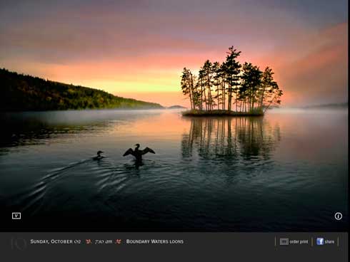
The app contains video commentary, where Jim discusses how and why he took some of the shots. Throughout the book, we wanted the photography to be big, beautiful, and to take center stage. We didn't want video elements and icons to clutter up the screens. We also wanted the user to be able to view the photo while the video was playing.

If a particular photo has an accompanying video, there is a small "v" icon in the bottom left corner. When a user taps the "v" icon, the video plays in a 320px by 240px area in the bottom left corner. How did we do this?


Photo 1


Photo


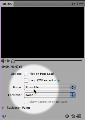
The trick is to create a transparent "poster frame". We created a 320px by 240px PSD file in Photoshop that contains the white "v" icon artwork on a transparent background. We then used this mostly-transparent file as the "poster frame" for the video. You can choose a poster frame file for DPS video using the Media panel.

Mediapanel


Wednesday, November 23, 2011

DPS app design spotlight: U of Dayton Viewbook

(This is the second in an intermittent series of posts highlighting interesting or innovative apps built using Adobe Digital Publishing Suite.)

Kudos to the designers who produced the University of Dayton Undergraduate Viewbook app. This free, vertical-orientation-only iPad app is a "viewbook" for prospective undergraduate students, intended to give them a feel for the campus, programs and values of the University of Dayton. If you are interested in learning what works well in an iPad app I'd encourage you to download this app and explore it. Here are a few things I like:

On the first screen after the video cover screen, you'll see the simple screen below, This doesn't appear in the screen shot, but the sidebar "We believe that life is to be experienced" rotates through several "We believe..." statements every 3 seconds or so. This is a nice, subtle use of the DPS slideshow feature with "Auto Play" specified.

Photo

I like the mechanism they designed for revealing facts and tidbits of information, as shown in the bottom of the screen shot below. This is done with InDesign buttons and a multi-state object.

Photo

In the side-by-side screen shots below, the Images change in place when the buttons are tapped while the copy remains static. Simple to execute in InDesign/DPS, yet a nice way to present multiple views without adding extra screens.

Photo3ab

This is a nice use of vertically scrolling text in the blue sidebar.

Photo

Here's a nice example of a graphic illustrating the distance from U of Dayton to various destinations in the U.S. Again, this is just buttons and a multi-state object. Note also the "top" button to take the user back to the top of the article--a nice touch.

Photo5

This app contains an abundance of other tasteful interactivity. Remember, the point of interactivity in an app like this is to engage the reader and make the app "sticky" so the user spends more time learning about the University. I think that the U of Dayton succeeded in spades with this app.

Wednesday, November 16, 2011

DPS app design spotlight: Nat Geo slide show

(This is the first in an intermittent series of posts where I plan to highlight interesting or innovative apps built using Adobe Digital Publishing Suite.)

National Geographic is doing some interesting things in their DPS apps. A couple different photo treatments in the November 2011 issue of National Geographic Magazine caught my eye today. These are nice examples of breaking out of the box of the usual "photos stacked on top of each other" metaphor.

Photo

Photo 1

Several things I want to point out about this example:

1. Note how the portrait and landscape images along with the associated captions "wrap" around the image thumbnails, rather than just presenting the slides and captions in a fixed-size "box" above or beside the thumbnails. This is possible in DPS because buttons can appear above multi-state objects, as long as the buttons have both a normal state and a click state.

2. The image thumbnails are not just shrunken, hard-to-recognize versions of the larger photos. The designer has cropped out a small, recognizable detail of the larger photo.

3. The "click" state of each thumbnail has a light blue stroke, so the user can tell which image is currently displayed.

4. The DPS "Swipe to change image" option is active, so the user can swipe across each image instead of clicking on the thumbnails. Personally, I wouldn't activate this feature when so much of the screen is occupied by the multi-state object. When "Swipe to change image" is active, the user can't swipe across the image to move to the next screen. I think this will inevitably confuse users. To Nat Geo's credit, they added a right-pointing arrow icon in the upper-right corner to prompt the user to swipe there, instead of in the image area.

Here's another interesting example:

Photo 2

Photo 3

While this example looks complex, it is just multi-state objects activated by buttons. Because of the way things overlap, it's just a little harder to set up. I like the way the background is partially obscured by a gray box when the photo is enlarged.

Production hint: Since a multi-state object in DPS cannot contain an actual, working button, the visible show and hide buttons are actually "dead" artwork that are part of the hidden/visible states of the multi-state object. Drawn on top of each these icons is a frame with no fill or stroke that is made into a button with a "Go to State" action.

Friday, September 17, 2010

Interactive design tutorials and white paper

I've been spending a lot of time lately helping "print" designers get up to speed on designing interactive projects. A few months ago Adobe hired me to create some training resources about interaction design. The result is four free resources that can be found on Adobe.com (click on the "interactive" tab on this page.

All these resources are intended to equip designers with what they need to know to move into interaction design. The resources include:

A comprehensive 17 page white paper titled Interaction design: Designing for interactivity on screens: a primer for print designers (pdf)

Three "Interaction 101" video tutorials on Adobe TV. Each 10-15 minute video covers a single interactive workflow, and includes source files so you can follow along:

Interaction 101: Create an Interactive Guide with InDesign CS5
How to use InDesign CS5 to create an interactive document for the Web.
(related source files)

Interaction 101: Create a simple web application with Flash Catalyst CS5
How to use Illustrator CS5 and Flash Catalyst CS5 to create a web application.
(related source files)

Interaction 101: Create a simple banner ad with Flash Professional CS5
How to use Photoshop CS5 and Flash Professional CS5 to create a web banner ad.
(related source files)

Thursday, March 18, 2010

Free t-shirt mockups

So you've designed the next killer t-shirt design (like the one below!), but you want to preview what it will look like on an actual shirt? A new web site lets you do this in a couple of clicks...free!

ShirtMockup.com lets you choose from a variety of t-shirt styles, upload your artwork, position it on the shirt, change the shirt color, and download a jpeg of the results.

Other options for mocking up t-shirts include Photoshop templates from Arsenal, or some of these free resources at SpoonGraphics.

Monday, August 03, 2009

Advice for designers during tough times

The 2009 AIGA|Aquent Survey of Design Salaries 2009 is available now. In addition to the usual tables that summarize average salary ranges for designers, art directors, production artists and copywriters around the United States, this year's issue contains insightful commentary from top designers on how to stay competitive during an economic downturn.

A few excerpts:

"Position yourself narrowly so that you are less relevant to the majority but deeply sought by a minority that values expertise." -- David C. Baker

"Focusing does not mean cutting back on what you know—only perhaps on what you do. There’s a big difference." -- Alexander Isley

"Many of us designers look down our noses at the business aspect of our profession, in which creativity reigns supreme. Never forget that if you do not operate your practice like a business, there will be no place for your creativity to live." -- Judy Kirpich

"When was the last time you picked up the phone and connected in person with your most important contacts? If you have people out there advising and advocating for you, be sure to keep them apprised of how you’re doing, thank them often and stay in touch regularly—no matter where you’re at with employment. This is one of the most valuable uses of downtime, but it’s actually something designers should be doing at all times!" -- Monica Little

You can download the entire report in PDF format here.