Monday, December 19, 2011

DPS app design spotlight: Van Gogh's Dream

(This is the fourth in an intermittent series of posts highlighting interesting or innovative apps built using Adobe Digital Publishing Suite.)

Van Gogh's Dream is an amazing piece of work. If you have any interest in the work of Vincent van Gogh, this is a must-have. But even if you don't, it is well worth the $10 to see the design, organization, and interface concepts used very effectively in this app.

The designers did so many things well. I'm only going to highlight a couple of things here. First, I like the way they used Unibody 8, a "screen type" for areas where very small type is needed. At the iPad's 132 pixels per inch resolution, it is difficult to render extremely small type clearly. Using fonts that don't employ any anti-aliasing (sometimes known as "bitmap" fonts) such as Unibody 8 or one of the fonts in the Minifonts line is a good idea. In the screenshot below, I've highlighted the use of Unibody 8 with yellow.

Screen1


Another innovation that I like in this app is the Table of Contents and Help screens. The TOC does a nice job of giving the user a "birds-eye" view of how this complex, content-rich app is organized. I like the way it gives the user a feel for how much content is in each section at a glance.

Screen2


When you tap the "Show the User's Guide" button, instead of a typical DPS help screen, you get a "full-size" replica of the DPS interface elements, with helpful explanations pointing to each icon.

Screen3


Spend some time exploring this cool app, and I'm confident you'll discover many other good DPS design ideas!


Monday, December 05, 2011

DPS app design spotlight: Chased By The Light

Apple just approved our latest iPad app, Jim Brandenburg's Chased By The Light. Lynn Phelps (Phelps Design) did the design, I did the technical production. This app is derived from the popular coffee table book of the same name. The RGB photos look stunning on the iPad...surpassing the best CMYK printing. We used InDesign and the new Adobe Digital Publishing Suite Single Edition to create the app.

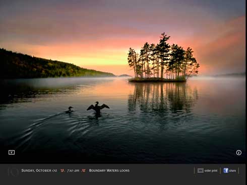
The app contains video commentary, where Jim discusses how and why he took some of the shots. Throughout the book, we wanted the photography to be big, beautiful, and to take center stage. We didn't want video elements and icons to clutter up the screens. We also wanted the user to be able to view the photo while the video was playing.

If a particular photo has an accompanying video, there is a small "v" icon in the bottom left corner. When a user taps the "v" icon, the video plays in a 320px by 240px area in the bottom left corner. How did we do this?


Photo 1


Photo


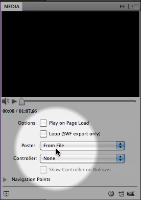
The trick is to create a transparent "poster frame". We created a 320px by 240px PSD file in Photoshop that contains the white "v" icon artwork on a transparent background. We then used this mostly-transparent file as the "poster frame" for the video. You can choose a poster frame file for DPS video using the Media panel.

Mediapanel


Wednesday, November 23, 2011

DPS app design spotlight: U of Dayton Viewbook

(This is the second in an intermittent series of posts highlighting interesting or innovative apps built using Adobe Digital Publishing Suite.)

Kudos to the designers who produced the University of Dayton Undergraduate Viewbook app. This free, vertical-orientation-only iPad app is a "viewbook" for prospective undergraduate students, intended to give them a feel for the campus, programs and values of the University of Dayton. If you are interested in learning what works well in an iPad app I'd encourage you to download this app and explore it. Here are a few things I like:

On the first screen after the video cover screen, you'll see the simple screen below, This doesn't appear in the screen shot, but the sidebar "We believe that life is to be experienced" rotates through several "We believe..." statements every 3 seconds or so. This is a nice, subtle use of the DPS slideshow feature with "Auto Play" specified.

Photo

I like the mechanism they designed for revealing facts and tidbits of information, as shown in the bottom of the screen shot below. This is done with InDesign buttons and a multi-state object.

Photo

In the side-by-side screen shots below, the Images change in place when the buttons are tapped while the copy remains static. Simple to execute in InDesign/DPS, yet a nice way to present multiple views without adding extra screens.

Photo3ab

This is a nice use of vertically scrolling text in the blue sidebar.

Photo

Here's a nice example of a graphic illustrating the distance from U of Dayton to various destinations in the U.S. Again, this is just buttons and a multi-state object. Note also the "top" button to take the user back to the top of the article--a nice touch.

Photo5

This app contains an abundance of other tasteful interactivity. Remember, the point of interactivity in an app like this is to engage the reader and make the app "sticky" so the user spends more time learning about the University. I think that the U of Dayton succeeded in spades with this app.

Thursday, November 17, 2011

Still on CS4 or older? Adobe announces upgrade policy for CS6.

In a recent blog post Adobe announced pricing for Creative Cloud, which, among other things will offer subscription pricing for Creative Suite products.

But also in this blog post is the folowing nugget:

"With regards to upgrades, we are changing our policy for perpetual license customers. In order to qualify for upgrade pricing when CS6 releases, customers will need to be on the latest version of our software (either CS5 or CS5.5 editions). If our customers are not yet on those versions, we’re offering a 20% discount through December 31, 2011 which will qualify them for upgrade pricing when we release CS6."

So, if you don't think you'll be enrolling in Creative Cloud, but prefer a perpetual license, it might be smart to upgrade to CS5.5 while you can.

Wednesday, November 16, 2011

DPS app design spotlight: Nat Geo slide show

(This is the first in an intermittent series of posts where I plan to highlight interesting or innovative apps built using Adobe Digital Publishing Suite.)

National Geographic is doing some interesting things in their DPS apps. A couple different photo treatments in the November 2011 issue of National Geographic Magazine caught my eye today. These are nice examples of breaking out of the box of the usual "photos stacked on top of each other" metaphor.

Photo

Photo 1

Several things I want to point out about this example:

1. Note how the portrait and landscape images along with the associated captions "wrap" around the image thumbnails, rather than just presenting the slides and captions in a fixed-size "box" above or beside the thumbnails. This is possible in DPS because buttons can appear above multi-state objects, as long as the buttons have both a normal state and a click state.

2. The image thumbnails are not just shrunken, hard-to-recognize versions of the larger photos. The designer has cropped out a small, recognizable detail of the larger photo.

3. The "click" state of each thumbnail has a light blue stroke, so the user can tell which image is currently displayed.

4. The DPS "Swipe to change image" option is active, so the user can swipe across each image instead of clicking on the thumbnails. Personally, I wouldn't activate this feature when so much of the screen is occupied by the multi-state object. When "Swipe to change image" is active, the user can't swipe across the image to move to the next screen. I think this will inevitably confuse users. To Nat Geo's credit, they added a right-pointing arrow icon in the upper-right corner to prompt the user to swipe there, instead of in the image area.

Here's another interesting example:

Photo 2

Photo 3

While this example looks complex, it is just multi-state objects activated by buttons. Because of the way things overlap, it's just a little harder to set up. I like the way the background is partially obscured by a gray box when the photo is enlarged.

Production hint: Since a multi-state object in DPS cannot contain an actual, working button, the visible show and hide buttons are actually "dead" artwork that are part of the hidden/visible states of the multi-state object. Drawn on top of each these icons is a frame with no fill or stroke that is made into a button with a "Go to State" action.