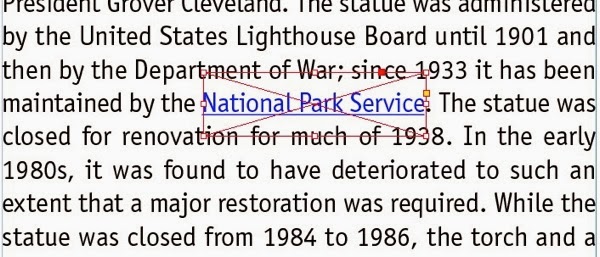
The most common way to create hyperlinks in body text in an Adobe Digital Publishing Suite or interactive PDF project is to use the Type tool to select the text that should contain the hyperlink, right click, and choose Interactive > New Hyperlink (CS6) or Hyperlinks > New Hyperlink (CC) from the context menu. The trouble with assigning a hyperlink to selected text, is that the “tap zone” for the hyperlink is only the height of the text characters, which can make it difficult to tap accurately on a tablet.
A workaround is to position a generously-sized frame with no fill and no stroke on top of the type, and assign a hyperlink to the frame. This will make the tappable region as large as the frame. Easy enough. The trouble comes when you have many of these scattered through a long section of body text, and edits cause the text length to grow or shrink, and the frames no longer line up with their associated text..
The best way to deal with this it to anchor the frames to the text. Here are the steps I use:
1. Draw a frame with no fill/stroke above the text that you want to be assigned a hyperlink. Make the frame the length of the text, but larger in height.
2. Right-click on the frame, and choose Interactive > New Hyperlink (CS6) or Hyperlinks > New Hyperlink (CC) from the context menu, and enter the url for the hyperlink. Or, use the Hyperlinks panel to assign the hyperlink.
3. Grab the solid square that is visible in the upper-right top edge of the frame, and drag it to just before the first character of your hyperlinked text. In my screenshot above, the square is red, because my frame is on a red layer. The square will be blue on a blue layer, etc. If you don’t see the square, be sure that your frame edges are displayed (View > Extras > Show Frame Edges) and choose View > Extras > Show Anchored Object Control.
4. This will anchor the object to the location just before the text that should be hyperlinked. The solid square is replaced by an anchor symbol, and if you choose Type > Show Hidden Characters, you will see a “yen” symbol indicating the location in the text where the rectangle is anchored.
5. Next, right-click on the frame and choose Anchored Object > Options. Fill in the dialog box as shown, so that the position of the object will move properly with the text. Your value for “Y Offset” may need to be slightly different, depending on the size of your text, leading, and frame size.
6. That’s it. Now, when the text becomes longer or shorter, the frame will move with the associated text.
It would save you some work to create an object style for the hyperlink frame, since an object style can memorize the Anchored Object Options.
This isn’t perfect. If the text that is to be hyperlinked breaks at the end of a line, the box won’t break with it. But it is helpful in most cases.


No comments:
Post a Comment