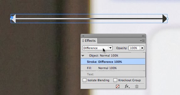
I was working on an InDesign project, and was using white arrows and black arrows on top of various images to indicate swipe direction for an Adobe Digital Publishing Suite project. The white arrow worked great on dark images, and the black arrow worked great on light images. But then I ran into an image that had a half dark/half light background. What to do? InDesign's Blend Modes to the rescue.
1. Create an arrow, and fill it with white (the [Paper] color in most projects)
2. Use the Effects panel (Window > Effects) to change the Blend Mode of the stroke to Difference.
3. The result? An arrow that is light where it appears on a dark background, and dark on a light background.
This technique will also work in Illustrator, Photoshop, and After Effects, since these programs all feature a "Difference" blend mode.


2 comments:
Brilliant! I suspect it will also work for that hardest of all layouts challenges, getting a book title to stand out against a background whose colors shift from light to dark.
--Michael W. Perry, My Nights with Leukemia: Caring for Children with Cancer
Brilliant! I have been using a graduated tone which is a bit of a pain...
Good thinking, Keith.
Post a Comment