Friday, December 12, 2014

How to install an .ipa file on an iPad or iPhone

When you build an iOS app using Adobe Digital Publishing Suite, Adobe’s DPS App Builder generates 2 files, a “Developer app”  in the form of an ipa file, and a “Distribution app” as a zip file.

Screen Shot 2014 12 11 at 9 22 06 PM


The Developer .ipa file is intended to allow you to test the app on your iPad or iPhone before you send the .zip file to Apple for review. To test the .ipa file, you need to install it on your iPad/iPhone. Unfortunately, you can’t use AirDrop, Dropbox, or a similar service to install the file. Apple provides 2 ways to do this. One way is to add the .ipa file to your iTunes library on your computer, and then sync your iPad/iPhone with iTunes. But if you have a lot of content on your device, this process can be maddeningly slow. It may take 5 or 10 minutes or more to complete.

A far faster, simpler way is to use Xcode. Xcode is a free Apple development tool used to build apps for Mac and iOS. But you don’t need to know anything about Xcode or app development to use this tool to quickly and easily install an .ipa file on your iPad or iPhone. Here’s how to do it with Xcode 6.1.1

1. Download and install Xcode.

2. Run Xcode. You’ll find it in your Applications folder.

3. Wire your iPad or iPhone to your Mac with a USB cable.

4. In Xcode, choose Window > Devices, or press command-shift-2. You should see your device displayed in the Devices window. 

Screen Shot 2014 12 12 at 6 56 15 AM


5. Either drag your .ipa file into the “Installed Apps” section, or click on the plus sign and select your .ipa file. This will install the development app on your device. There is a bug that sometimes causes the error message below to appear. If you get this message, and you have the correct device attached, just click the OK button and try again. It should work the second time.

Screen Shot 2014 12 12 at 6 52 01 AM


Tuesday, November 11, 2014

New output platform for Adobe DPS

Yesterday Adobe released version 32.3 of Adobe Digital Publishing Suite. This version allows you to publish your DPS app to the Windows 8.1 platform. If you do this, anyone running any Windows 8.1 device (except Windows phones) can download your app from the Microsoft Store and run it on their device. Windows 8.1 runs on desktop computers, laptop computers, the Microsoft Surface, and tablets from Microsoft partners such as Dell, Acer, Lenovo and others.  

Since Windows 8.1 supports touch, most new Windows laptops have a touch screen, which enables users of those devices to swipe and tap their way through your content.

With this addition, and proper planning and setup, you can publish DPS folio content to three platforms simultaneously: iOS, Android, and Windows 8.1.

Instructions on how to publish your DPS app to the Windows Store can be found here.

Instructions on how to publish your DPS app to Google Play can be found here.

Instructions on how to publish your DPS app to the Apple App Store can be found here.


Thursday, October 23, 2014

HWT fonts on Typekit

I really enjoy exploring the Adobe Typekit font library for new fonts. Remember, Typekit Desktop Fonts are a benefit for Creative Cloud subscribers. This is a quick and easy way to find a new face for your next project.

Recently I was searching for a font, and I stumbled across the fonts from the Hamilton Wood Type Foundry are available for desktop use on Typekit. I love the serendipity and discoverability of browsing fonts on Typekit. Here are a few examples of some of these fonts:


HWT sample

Adobe is steadily growing the number of fonts on Typekit that are available for desktop use. As of this writing, there are 286 font families available for desktop syncing. Font Families contain multiple fonts of different weights and styles. 

Sunday, October 12, 2014

How to enable background photo uploading with Dropbox on iOS

The latest version of the Dropbox app for iOS devices (as of this post, version 3.4.2) has a cool feature for uploading photos on your phone to your Dropbox account without having to launch the Dropbox app. But this feature isn’t enabled by default, and it isn’t obvious how it works. In this post, I’ll show you how to enable this feature.

But first, I want to mention my “Up and Running with Dropbox" course at lynda.com. If you want to get more out of Dropbox, and learn all that this powerful service can do for you, watch this course!

Now, here’s how to enable background uploading of photos:

1.  Run the Dropbox app on your iPhone or iPad, and tap the “Settings” gear in the lower-right corner

2014 10 12 21 21 29


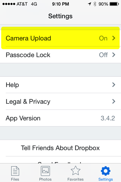
2. Tap the “Camera Upload” option


2014 10 12 21 10 45


3. Turn on the “Camera Upload” and “Background Uploading” options.


2014 10 12 21 10 55


4. Launch the “Settings” app.

5. You will see some of your apps listed at the bottom of the list of settings. Tap the “Dropbox” app in this list.

6. Enable “Background App Refresh”, and then tap the “Privacy” option.

2014 10 12 21 11 55


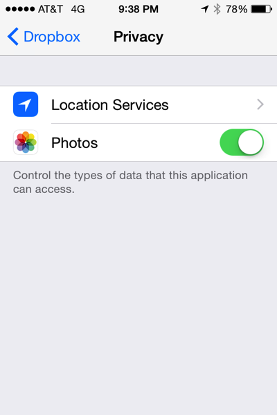
7. Turn on “Photos” so that Dropbox can access your Photos, then tap “Location Services”. 


2014 10 12 21 38 19

8. Choose “Always”.

2014 10 12 21 38 14

Because of Apple limitations, the Dropbox app is only allowed to upload for a short time after you quit the Dropbox app. The way that Dropbox gets around this is to use Location Services. whenever your location changes a significant enough amount, Dropbox will sense the location change, and an upload will occur. Try it! It works well for me.

Thursday, October 09, 2014

Reflecting on Adobe MAX

I’m flying back from the Adobe MAX conference, and trying to process all that I heard and saw. Here are my conference take-aways:

1. This was billed as the “Creativity Conference”. For many years, MAX was a developer conference. Then in recent years it morphed into a designer/developer conference. This year MAX was almost entirely a designer conference, with far fewer breakout sessions for developers, and very little developer-oriented content during the keynotes.

2. Adobe believes that mobile devices can help designers capture inspiration wherever they find themselves. See Adobe Shape CC, Adobe Color CC, and Adobe Brush CC. If these kinds  of apps can be made easy enough to use quickly and fluidly, without getting in the way, I think this is really smart.

3. Adobe thinks that designers want to sketch ideas on tablets, and that illustrators want to begin, and perhaps even finish, projects on tablets. See Adobe Illustrator DrawAdobe Illustrator Line, and Adobe Photoshop Sketch. While some illustrators are treating the tablet as a new medium, fully embracing it for content creation, and creating amazing work, other designers find it a poor substitute for physical pencil and paper for sketching. In my experience, tablet use in general by designers is not as high as some might think, so that may be a barrier in the short-term.

4. Adobe believes that photographers want to do some degree of Photoshop-style editing on tablets. See Adobe Photoshop Mix, and Adobe Photoshop Lightroom.

5. Adobe is in love with Microsoft. I overheard an attendee say that, “Adobe and Microsoft are getting married…or at least starting a relationship”. Adobe CEO Shantanu Narayen and Microsoft CEO Satya Nadella appeared on-stage together at the end of the day 1 keynote session. They briefly mentioned some technologies that Adobe and Microsoft are working together to develop. In fact, each attendee at MAX left the conference with a free Microsoft Surface Pro 3 tablet and a 1-year subscription to Office 365.

6. Adobe is rethinking creative interfaces, as we know them, both for mobile and desktop use. I’m glad to see Adobe thinking about how we might use creative applications now and into the future. The versions of Illustrator CC and Photoshop CC that were released on 10/6/2014 each contain alternate interfaces for using these programs on touch-enabled Windows devices, such as the Microsoft Surface Pro 3. At the “Adobe Sneaks” event on Tuesday night, Adobe showed several intriguing examples of work they are doing to try to simplify drawing curves in Illustrator, creating complex patterns, and performing difficult Photoshop tasks. 

7. Adobe is continuing to think about how they can leverage cloud services for the creative user. See the new CC libraries feature in Photoshop and Illustrator.

8. From my perspective, there was a great deal of interest in Adobe DPS. I taught 3 jam-packed “Introduction to Adobe DPS" labs of 70 people each, and there were many, many other DPS labs and sessions offered throughout. All appeared to be well attended.

I’d encourage you to spend some time watching the keynote sessions here. Many of the non-lab breakout sessions were also recorded and viewed here. Some really good stuff to view!

Next year’s conference is already scheduled for October 3-7, 2015 in Los Angeles. I’d encourage you to attend.

Saturday, October 04, 2014

A much improved DPS Android viewer

On September 29, Adobe quietly released Adobe DPS v32.1

This update included one documented bug fix, and several new features and improvements. But what caught my eye in the release notes was the promise that "PDF articles in Android apps now render more quickly, between 40 and 60 percent faster in tests."

I rebuilt a previously-released Android app with v32.1, and am amazed. The screen rendering on my Google Nexus 7 tablet is blindingly fast. I would say it is on par with the rendering speed of the same screens in the iOS version of the app running on my iPad Air. If you have an Android tablet, download the app and judge the performance for yourself.

To use this update, you just need to edit your app and create a new .apk file with DPS App Builder, and submit the new .apk as an update to Google Play. Definitely worth doing. Good job DPS team!

Friday, September 19, 2014

Adobe DPS preview bug

Beware of this bug when previewing DPS articles on a USB-tethered iPad...

When you tether an iPad to your computer with a USB cable, you can get immediate feedback of exactly how your layout looks on the iPad screen. If you’ve never done this before, here’s how:

1. Connect your iPad via a USB cable to your computer

2. Make sure that the iPad is turned on and “awake”

3. Run Adobe Content Viewer on the iPad

4. At the bottom of the Folio Overlays panel, click the Preview button. After a brief pause, a drop-down menu will appear with the name of your iPad listed. Choose this, and after a short delay the InDesign file you are working on will appear on the iPad screen.

ScreenSnapz001

But here’s the bug…If you have a Master Page displayed on your screen, the preview doesn’t work. The “Preview on [your iPad name]” option still appears in the drop-down menu, but the preview never displays on the iPad. The Desktop preview still works in this case, but not the iPad preview. 

So be sure to turn to an actual document page, not a master page, before previewing content on your iPad!

Thursday, August 21, 2014

How to create dual-orientation fixed layout EPUB from InDesign

The 2014 release of InDesign CC creates really nice fixed layout EPUBs that will work on iOS and Android devices. However, when you view your fixed layout EPUB on an iPad with iBooks, our content will appear in only a single orientation, either portrait only or landscape only, depending on the orientation of your InDesign layout and what you choose for the “Spread Control” option in the EPUB - Fixed Layout Export Options dialog box. 

If you want your readers to be able to view your content in either portrait or landscape view, do the following:

1. Export your fixed layout EPUB from InDesign

2. Use eCanCrusher to expand the exported .epub file into a folder

3. Open the folder created by eCanCrusher, and locate the file named “content.opf” in the “OEPS” folder

4. Open this file with a text editor. Edge Code (part of your Creative Cloud subscription) is a good tool for opening and editing this type of file

5. Find the line <meta property="rendition:orientation”>landscape</meta> or <meta property="rendition:orientation”>portrait</meta> near the beginning of the file

6. Change landscape or portrait in this line to “auto”, so that the line appears as <meta property="rendition:orientation”>auto</meta>

7. Save and close the content.opf file

8. Use eCanCrusher to compress the folder back into an .epub file


Wednesday, August 13, 2014

10 things to know about multi-state objects and buttons in InDesign and DPS

Mastering how to create multi-state objects controlled by buttons is the key to creating all kinds of rich interaction in InDesign and Adobe Digital Publishing Suite. To that end, here are 10 things that you need to know about multi-state objects (MSOs) and buttons:

1. Always keep the Buttons and Forms, Object States, and Layers panels open and visible when creating interactive effects.

You will need to refer to these panels frequently, so for your own sanity, open them up, park them on your screen, and leave them there. The Layers panel, not often used for print projects, is used heavily in interactive projects for locating, selecting, or moving page items that are within groups, object states, or buttons.
 

2. Always work with Frame Edges displayed

Choose View > Extras > Show Frame Edges so that you can easily see the edges of the “hidden” states of MSOs and clear buttons.
 

3. Always name your MSOs, states, and buttons

Yes, InDesign will ensure that your MSOs, states, and buttons are given unique names, so that everything will work as it should. But the more complex your interaction gets, the more you will appreciate having an MSO named “national parks mso” and states named “yosemite”, “rocky mountain”, and “joshua tree” rather than “Multi-state 23” and “State 1”, “State 2”, and “State 3”. The names that you give these MSOs, states, and buttons will appear in the Layers panel, making selecting objects through the Layers panel easy.
 

4. Double-click to “dive” down into the objects in an MSO, hit the Esc key to “climb” back out

With an MSO selected, double click on an object to dive into the MSO state that contains that object and select the object. Then, hit the Esc key once to select the state, and again to select the “parent” MSO. Depending on how objects within the states are grouped, you may need to double-click repeatedly to access the objects within groups, and then hit the Esc key repeatedly to climb back out. This simple technique is a huge time- and effort-saver once you master it.
 

5. There is no such thing as a multi-state object with one state

It should be no surprise that a multi-state object must have multiple states. This can be useful. If you select a single page item, and choose New State from the Object States panel menu, a 2-state MSO will be created, with the page item you selected in each state.
 

6. There is no such thing as an empty state in a multi-state object

Every state in an MSO must have at least one page item in it. So, if you need a state that consists of “nothing”, you will need to create a frame that has no fill and no stroke, and add that to the state. This is a common technique for creating “pop-up” or “overlay” boxes that appear on the screen when a button is tapped.
 

7. The initial display of an MSO is always its first state

Regardless of which state is selected in the Object States panel, when the page appears on a mobile device, the first state (the state at the top of the Object States panel) is the state that will be initially displayed.
 

8. Buttons located outside an MSO can only “see” MSOs on the current page

In other words, there is no way for a button on page 2 to control an MSO on page 3.
 

9. Buttons located inside an MSO state can only “see” states within the parent MSO

In other words, a button that is in an MSO state can’t control a different MSO on the page.
 

10. Button objects are always converted to raster data when displayed

If you convert vector artwork, type, or an InDesign frame, line, polygon, etc. to a button, the nice crisp vector objects will be rasterized when viewed on a mobile device. For this reason, whenever possible I leave the artwork untouched, and create a clear frame over the artwork and use this frame for the button instead. This has the added benefit of allowing you to have small button artwork with a large tap zone.
 

Bonus tip: Save your sanity and purchase Digital Publishing Pack 1, Digital Publishing Pack 2, and Object States Assistant.

These scripts and plug-ins take a lot of the repetitive pain out of working with complex MSOs and buttons.

Thursday, August 07, 2014

How to Use in5 to Include InDesign-generated Animation in DPS Articles

As you may know, I contribute to the InDesignSecrets blog, run by my friends David Blatner and Anne-Marie Concepcion. I just posted a detailed article there about how to use the InDesign extension in5 to export native InDesign-created animation for use in Adobe DPS articles. If you work with Adobe DPS, you need to check this out!

Tuesday, July 29, 2014

How to type a tab character in an InDesign table

When you are working with a table in Adobe InDesign, pressing the Tab key moves you from cell to cell within the table. But what if you want to actually include a tab character in the text within a cell?

On the Mac, you can simply press option-tab to insert a tab character in a table cell. But in Windows, alt-tab is reserved for switching between running apps (try it, its really useful!). So in Windows InDesign, you can insert a tab character in a table cell by choosing Type > Insert Special Character > Other > Tab. If you need to do this frequently, consider adding a keyboard shortcut for this command. Here’s how:

1. In InDesign, choose Edit > Keyboard Shortcuts.

2. Fill in the dialog box as show below, and then click the Assign button.

ScreenSnapz002 copy

3. When prompted to create a new set, click Yes.

ScreenSnapz003

4. Give the set a name, and click OK.

ScreenSnapz004

Now, you can just press ctrl-tab to insert a tab character within a table cell.

Friday, July 25, 2014

Friday, July 11, 2014

Easily create DPS splash screens

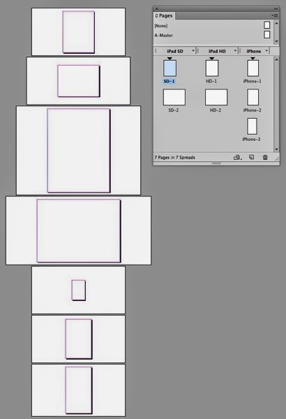
Every Adobe Digital Publishing Suite app for the iPad must contain 4 splash screens in the following sizes: 768 x 1024 pixel, 1024 x 768 pixel, 1536 x 2048 pixel, and 2048 x 1536 pixel. For iPhone apps, you must include 3 splash screens sized to 320x480, 640x960, and 640x1136 pixels. These splash screens must be saved in the PNG format. The splash screen appears on the screen momentarily while the app loads.

I’ve created an InDesign template to make creating these various sizes of the splash screens quick and easy. You can download the template here

ScreenSnapz001

The template contains 7 pages in each of the pixel dimensions listed above. Create your desired artwork on the pages corresponding to the sizes that you need, then choose File > Export and export the pages in PNG format. Fill in the Export PNG dialog box as shown below, and PNGs with the exact dimensions required will be output.

ScreenSnapz002

Unfortunately, InDesign only exports PNG-24 images. To save on file size in your app, you should open each of these PNG images in Photoshop, choose File > Save for Web, and save each file in PNG-8 format.

Thursday, June 12, 2014

How to embed video in a DPS scrollable frame

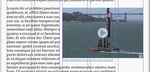
When creating scrollable frame content for Adobe DPS, the scrolling content can be a group of any type of InDesign objects, both static and interactive. You can group together text frames, images, buttons, and multi-state objects, and then make the group scrollable. However, if you try to include video in the scrollable frame group, you’ll find that it doesn’t work. After you paste the group into the “container frame” and go to the Folio Overlays panel, you’ll see that the options for video are displayed, not the options for scrollable frames.

Here’s a workaround that makes it possible to include embedded video in scrollable frames:

1. Group all the content together that you want as scrolling content, except for the video

2. Create a frame the same size as the outer bounds of the scrolling content, and name this frame “Container frame” in the Layers panel

3. Cut the scrolling content group

4. Select the Container frame, and choose Edit > Paste Into

5. In the Folio Overlays panel, choose Scrollable Frame, and select the desired scroll direction and other options

6. Place the video that you want to include in the scrolling content

7. In the Layers panel, drag the video into the Group that is inside the Container frame

ScreenSnapz001

ScreenSnapz002

8.  In the Folio Overlays panel, set your video playback options as desired

9. Position the video where you want it to be in the scrolling content

10. Resize the Container frame so that it is smaller the the scrolling content group.

Wednesday, June 04, 2014

Boat in the pond

This post is a break from my usual digital publishing technology posts. As some of you know, I’m nuts about sailing. I’ve spent the last few days training and consulting at Oracle Corporation headquarters in Redwood City, CA. You may know that Oracle is a major sponsor of the America’s Cup.  

The main Oracle campus features a small pond in the center. This month they delivered USA-17, the trimaran that won the 33rd America’s Cup in 2010, to the middle of the pond. It was airllifted into place by a helicopter. As you can imagine, the trimaran looks gigantic in the middle of the pond.

Some statistics about the boat:

  • The mast is 20 stories high
  • The boat took 150,000 man-hours to build
  • The enormous hull is 90 feet x 90 feet square (bigger than a baseball infield)
Here’s a photo of the mast being trailered in:
 

Oracleboat

The boat in its final resting place:

2014 06 04 16 33 13

2014 06 04 16 39 16

2014 06 04 16 25 57

2014 06 04 16 27 59

2014 06 04 16 31 23

2014 06 04 16 32 26


Sunday, June 01, 2014

How to make the Photoshop Crop tool behave like older versions

I did some Photoshop training last week, and was reminded again how much some people dislike the behavior of the “new and improved” crop tool that was introduced in Photoshop CS6.

What people dislike the most is the new behavior where Photoshop continuously centers the crop area on the screen as you resize and reposition the crop boundary. If this bothers you, pick up the crop tool, click on the gear icon in the Options bar, and uncheck the Auto Center Preview option. This will turn off the auto centering behavior, and the crop tool will behave similar to previous versions.

ScreenSnapz001

Another complaint I hear is that people dislike the way Photoshop applies a crop boundary to the image as soon as you click on the Crop tool. If you don’t like where the crop boundary is positioned, it takes longer to move and resize the boundary than to just create a new one. But did you know that you can just ignore the crop boundary that Photoshop creates, and drag to create an entirely new boundary? You don’t need to resize/reposition the boundary that is there.

In case you’ve missed it, I’d like to point out the Delete Cropped Pixels choice in the Options bar. If you uncheck this option, cropping is non-destructive. In other words, as long as you save your image as a layered PSD or TIFF file, the pixels outside the crop boundary are retained, so that you can adjust the crop boundary in the future. 

Tuesday, May 27, 2014

How to add YouTube streaming video to a DPS article (part 2)

There are several ways to add video to Adobe Digital Publishing Suite projects. This blog post assumes that you want to add a video that will stream into the article from YouTube, and you want the video to play full screen when tapped. Video configured this way will require the user to have an internet connection. If you want the video to play within a frame of a specific size within your layout, see this previous post.

1. Create your layout in InDesign, place a high-qulity still image, or a screen shot from a selected frame of the video in the layout. The size and location of this image can be anything you want, since the video is going to play full-screen.

ScreenSnapz001

2. Locate the video on YouTube that you wish to embed.

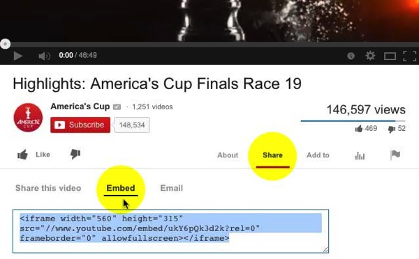
3. On the YouTube page beneath the video, click on Share, and then click on Embed.

Screenshot1

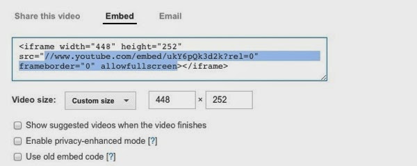
4. Select only the portion of the embed code that is highlighted in blue below, and copy it to the clipboard

ScreenSnapz004

5. In InDesign, select the frame from step 1, and select the Go To URL action

ScreenSnapz002

6. Paste the text you copied in step 4 into the URL field, directly after the http://

ScreenSnapz005

7. Add some artwork to indicate that the user can tap the image to play the video.

ScreenSnapz006

That’s it. Now when the user taps the image, the web browser that is built into DPS will overlay the page content, with the YouTube video queued up and ready to play. Then the user will need to tap again to play the video.

Tuesday, May 20, 2014

How to add YouTube streaming video to a DPS article (part 1)

There are several ways to add video to Adobe Digital Publishing Suite projects. This blog post assumes that you want to add a video that will stream into the article from YouTube, and you want the video to play in within a frame of a specific size in your layout. Video configured this way will require the user to have an internet connection. 

Technically, what you will be doing is “embedding” a streaming YouTube video in your DPS article. There are a couple of different ways to do this. Google occasionally changes the way this video embedding works, but this is the best way at the time of this writing.

1. Create your layout in InDesign, and create a frame on the page that is the exact dimensions that you want the video. Make a note of the width of this frame in pixels.

ScreenSnapz001

2. Locate the video on YouTube that you wish to embed.

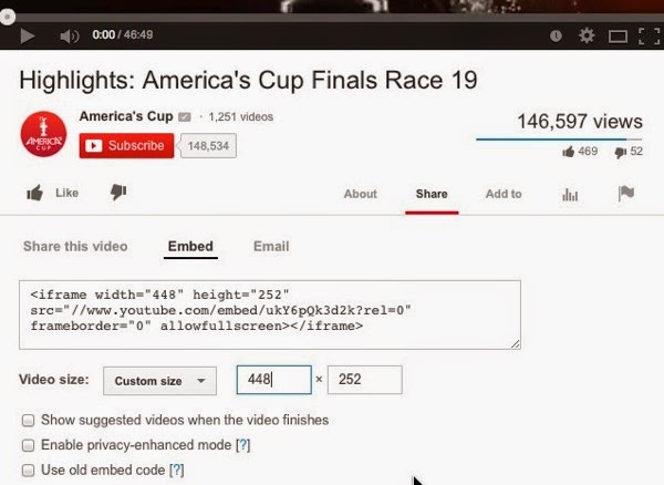
3. On the YouTube page beneath the video, click on Share, and then click on Embed.

Screenshot1

4. Still on the YouTube page, choose “Custom Size” for the the Video size, and enter the width of your InDesign frame, and make note of the value that is generated for the height.

ScreenSnapz002


5. Select only the portion of the embed code that is highlighted in blue below, and copy it to the clipboard

ScreenSnapz003

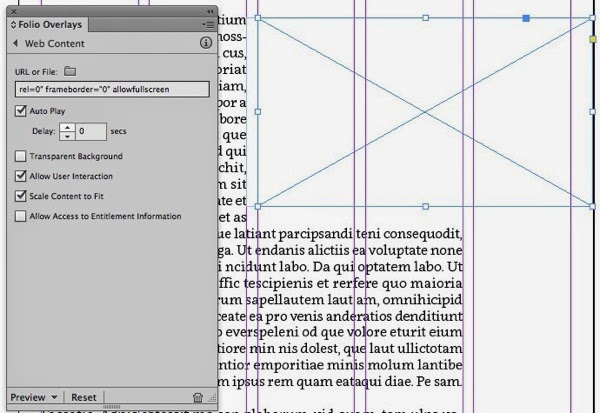
6. In InDesign, select the frame you drew in step one, and click on Web Content in the Folio Overlays panel.

ScreenSnapz005

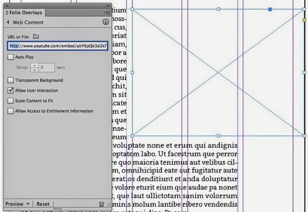
7. Paste the embed code into the URL field of the Folio Overlays panel

ScreenSnapz006

8. Use the left-arrow key on the keyboard to move the cursor to the start of the URL you just pasted, and type http: immediately before the double slash in the url.

ScreenSnapz007

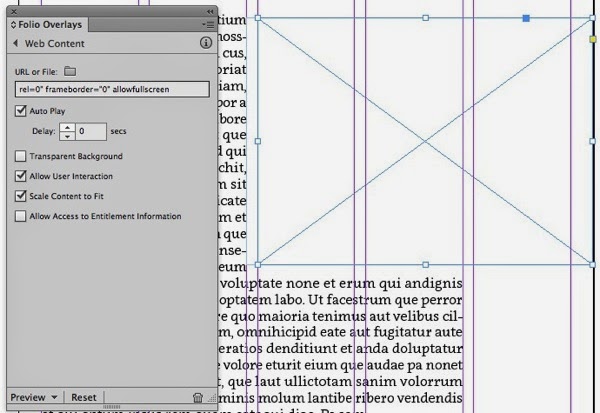
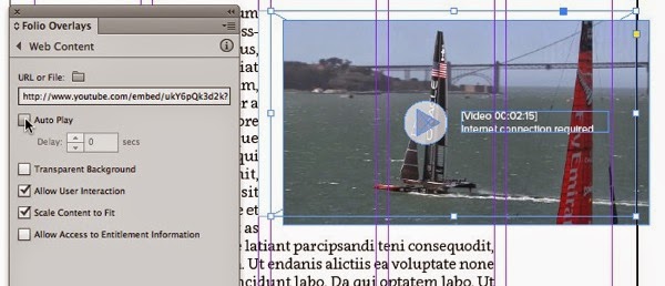
9. Select the Auto Play, Allow User Interaction, and Scale Content to Fit options. The Auto Play option will not cause the video to auto play, but will only cause the video to load into the frame automatically.

ScreenSnapz008

10. Change the height of the frame to match the value that YouTube generated in step 4.

ScreenSnapz009

11. That’s all that is required. You won’t see anything other than an empty frame in InDesign, but when you preview the article, you’ll see a single frame of the video along with the YouTube play button. Tapping anywhere in the video frame will play the video.

Photo

12. Usually, the random frame from the video that YouTube displays isn’t attractive. So I prefer to return to the YouTube website, play the video full-screen on my computer, and take a screen shot of a good frame from the video. Then I place that screen shot on top of the Web Content frame in InDesign, along with some artwork that looks like a play button. Then, I deselect the Auto Play option for the video frame. I’ve offset the screen shot in the image below so that you can see that it is separate artwork on top of the Web Content frame. Now, when the page is displayed, the user will see the screen shot image. When the user taps the screen shot, the Web Content will “play” and load the video, and Web Content frame will jump to the front and obscure the screen shot. Then the user will need to tap again to play the YouTube video. Another benefit of this approach is that the user will see the screen shot even if they don’t have an internet connection.

ScreenSnapz011


Thursday, May 08, 2014

Cool new iPad app: Adobe Voice

Today Adobe announced the availability of a new, free iPad app called Adobe Voice. This super simple app is for creating what David Pogue calls “explainer videos”. I don’t think I can possibly overstate how simple this app is to learn and use. The learning curve is about 5 minutes, tops.

From the time I installed the app, it took about 30 minutes to hammer together the basics of the video below, (and then another 45 minutes tweaking it because I’m obsessive!).


I can see a wide range of uses for this…not to mention that school kids will be all over this.

Create multiples while dragging an object in InDesign

InDesign CS5 and later has an obscure keyboard/mouse maneuver that allows you to create multiple duplicates of an object as you drag. Here’s how:

1. Select one or more objects with the Selection tool

ScreenSnapz001

2. Hold down the option key (Mac) or alt key (Windows), and THEN grab one of the selected objects. It is very important to hold down the option/alt key BEFORE you grab any of the objects.

3. Begin dragging the object(s) horizontally or vertically, and you’ll see a duplicate of the object appear, because you’re holding down the option/alt key

4. While continuing to hold down option/alt, hit the right arrow or up arrow key on the keyboard once to create one duplicate, twice to create 2 duplicates, three times to create 3 duplicates, etc. You will see a dotted outline appear on the screen indicating that duplicates are being created.

ScreenSnapz002

5. When the correct number of duplicates is positioned the way you want them, release the mouse and the option/alt key

ScreenSnapz003

Note that this is a different technique than the more well-known technique of being able to tap the up-arrow and right-arrow keys while dragging out a frame on the page to create a grid of boxes, or while dragging out a frame with the loaded place cursor. The technique I’m describing above is useful when the object or objects you want to duplicate are already on the page, and now they need to be duplicated or stepped and repeated.

Thursday, May 01, 2014

Open PDFs with Microsoft Word

Did you know that you can open PDFs in Microsoft Word 2013 for Windows? Just choose File > Open, select a PDF, and you’ll see the following dialog box before the PDF is converted to editable Word text:

ScreenSnapz001

PDFs that have complex layout will change in appearance significantly. If you don’t have the original fonts, they will be automatically be substituted with fonts on your system. In my limited tests, the conversion was far from perfect. But if you are working in Word, and just need to crack open a PDF to copy and paste some text, this could be useful.

As you would expect, PDFs that have password security applied can’t be opened with Word.

You can read more about this feature here.

Alas, this feature isn’t in Word for Mac 2011 (the latest version). 

For an alternate way to convert PDFs to Word, see PDF2Office (and PDF2ID) from Recosoft. If you have Adobe Acrobat Pro, you can open the PDF in Acrobat Pro and choose File > Save As Other > Microsoft Word.

Tuesday, April 22, 2014

The easiest way to share photos and videos with family, friends, and co-workers

Dropbox is essential to running my business. Its incredibly useful in so many ways. I like it so much that I authored a series of training videos called "Up and Running with Dropbox" for Lynda.com.

One of my favorite Dropbox features is the ability to share folders of images and video with any user, anywhere (they don't need a Dropbox account) with just a couple of clicks.

This is a fast, simple, low-overhead alternative to photo-sharing services such as Flickr, Picasa, SmugMug or Shutterfly. Watch the free excerpt from my Lynda.com course below to learn how.


Friday, April 11, 2014

2 free upcoming DPS Webinars

I’ll be doing two webinars for Adobe in the next few weeks.

1. Four Ways to Add Animation to Adobe DPS Apps on April 22

There are four ways to make things move on the screen in Adobe DPS apps: video clips, image sequences, animated slide shows, and HTML content from programs such as Adobe Edge Animate.

In this Webinar, you will see:

  • The pros and cons of each approach
  • When to use each method
  • How to optimize animation for the best performance
  • Examples of each method in use in the real world

… and more!

2. Working with Video Content in Adobe DPS Apps on May 20

Video content is one of the most desired features in many apps. Video content can be imported into Adobe InDesign CC, and then included in an Adobe DPS app. But there are many tips and techniques that can make this easier for you.

In this webinar, you will learn:

  • How to prepare video for use in Adobe DPS
  • When to embed video vs. stream video from a website
  • How to use video for introduction screens
  • When to set video to play full screen vs. playing "in place" in your layout

… and more!

These webinars are free! See more details and register here.

Tuesday, April 08, 2014

Once on Newsstand, always on Newsstand

If you are considering whether or not your app should go in the Newsstand category in the Apple App Store, take this into account: Once you’ve published an app in the Newsstand category, there is no going back. Apple documents this here. Specifically, they say "If a Newsstand-enabled app version has the the Ready for Sale status, you cannot disable Newsstand for any current or future versions of that app."

I have a customer that has an app on Newsstand, and now, for business- and marketing-related reasons, they want to remove it from Newsstand. When we discovered that this couldn’t be done in iTunesConnect, I called Apple to see if there was some way that they could override or make this change on their end. The answer was a clear “no”. So it looks like if you have an app on Newsstand, the only way to get the app out of Newsstand is to remove the app from the App Store, and publish an entirely new App. This is a poor solution, since there is no way to “update” users from one app to another.


Newsstand icon

Tuesday, March 25, 2014

DPS to drop support of InDesign CS5 and CS5.5 in fall of 2014

Currently, InDesign CS5, CS5.5, CS6, and CC are equal citizens for production of Folio content for Adobe Digital Publishing Suite projects. In other words, there isn’t anything in the Folio Builder panel or the Folio Overlays panel that is different between these versions.

However, according to the “What’s new in this release” notes for DPS v30:

"Advance notice: DPS to drop support of InDesign CS5.5 and CS5 in v32: With the v32 release (tentatively scheduled for September 2014), InDesign CS5.5 and InDesign CS5 will still be able to create source documents for DPS, but uploading articles to the Folio Producer Service will require InDesign CS6 or later."

So, if you’re still on InDesign CS5 or CS5.5 and you work with Adobe DPS, you’re probably going to have to upgrade come fall. It is unclear from this notice if users of CS5/CS5.5 will still be able to create interactive overlays for DPS. The notice states that they “will still be able to create source documents for DPS”, because these are just InDesign files, of course. But I suspect that the Folio Overlays panel will get revised, and no longer function with CS5/CS5.5.

Friday, March 14, 2014

New "must-have" plug-in for DPS

I just gave the new Object States Assistant plug-in from Automatication a whirl. All I can say is, if you do Adobe Digital Publishing Suite work, you must have this plug-in. Period.

The cornerstone of creating interactive content for DPS is multi-state objects (mso’s) and buttons. Complex interactive content can result in mso's with lots of states, and lots of buttons. The Objects States Assistant plug-in adds a bunch of missing commands for working with mso’s that should be included with InDesign, but are not. For example, you can:

- Add selected objects to all states in a single operation, and the objects stay in place and don’t lose their button actions

- Add objects to multiple states in a single operation, and the objects stay in place and don’t lose their button actions

- Paste objects into all states in a single operation, and the objects don’t lose their button actions

- Delete multiple states in a single operation

- Release multiple states in a single operation

- “Step and repeat” a single button and have each new button point to a different state in the mso

- Quickly display the next/previous state with a single button click

These commands are available through the OSA panel, which can be found in Window > Interactive > Object States Assistant, and also in the States panel menu. In the image below, I’ve docked the OSA panel with the State panel.

ScreenSnapz

Of course, you can add keyboard shortcuts with InDesign’s Keyboard Shortcut Editor to any of these new commands, making it even more useful.

Wednesday, March 05, 2014

2 Adobe DPS Webinar recordings to watch

I recently did 2 live Webinars for Adobe about the Adobe Digital Publishing Suite workflow. Below are links to recordings of the webinars if you’d like to watch them at your leisure. 

The first Webinar, presented on 1/16/2014, is titled “How to Create Content for Adobe DPS Apps”. You can watch the recording here.

The second Webinar, presented on 2/4/2014 is titled “How to Build Your First App and Submit it to the Apple App Store”. You can watch the recording here.

Monday, March 03, 2014

Global vs. Non-Global colors in Illustrator

Here’s an old feature of Illustrator that I find that people consistently don’t know about:

When you create a color swatch in InDesign, and then assign that swatch to a bunch of objects, when you later change the color of the swatch, all the objects that were colored with that swatch change also.

But Illustrator swatches behave completely different. By default, Illustrator process-color swatches are “non-global swatches”. This means that you can color objects with those swatches, but if you later change the swatch color, the objects do not change color. In other words, the swatch is used to initially color the object, but that’s it. There is no connection between the object and the swatch once the object is colored with the swatch.

However, you can make any swatch “global” by choosing this in Swatch Options. A global swatch in Illustrator behaves like the swatches in InDesign. When you apply a global swatch to an object, it is “assigned” to that object forever, so if you change the color of the global swatch later, the color of the object updates.

ScreenSnapz003

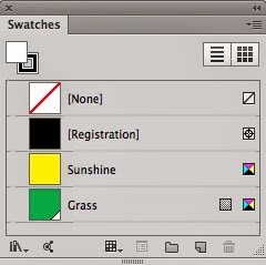
Global swatches appear in the swatches panel with a small white triangle in the bottom right corner.
ScreenSnapz002

This discussion only applies to process colors. Spot colors are always global in Illustrator. For more information, see the Illustrator help topic about this.